Heuristic Evaluation Report
706.021 Human-Computer Interaction 3VU SS 2017
Group G3-02
Florian Leski
Franz Mandl
Maximilian Weber
Paul Ganster
Heuristic Evaluation of the Web Site
https://www.tugraz.at/
Report of 20th April 2017
1 Executive Summary
1.1 Methodology
Every evaluator must think like a typical user. Our typical user is the prospective student who wants to gain as much information as possible. He/She visits the website and is looking for a degree. Once the right degree is found the user wants to get information about how to enroll to a specific study. We evaluated how user-friendly the website is for prospective students by assuming that they are already used to work with a pc. We performed many different actions how a user would interact on the TU Graz page like searching for degree programs or registration to TU Graz online. We also tried to think like other users. For example, employers, jobseekers, students or graduates.1.2 Main findings
Our team found 48 usability problems. The issues were rated according to their severity. Each evaluator must assess the problem with a number from zero to four where zero means "Not a Problem" and four "Catastrophic Problem". The seven problems with the highest rating were listed below.- Valid mail address is invalid
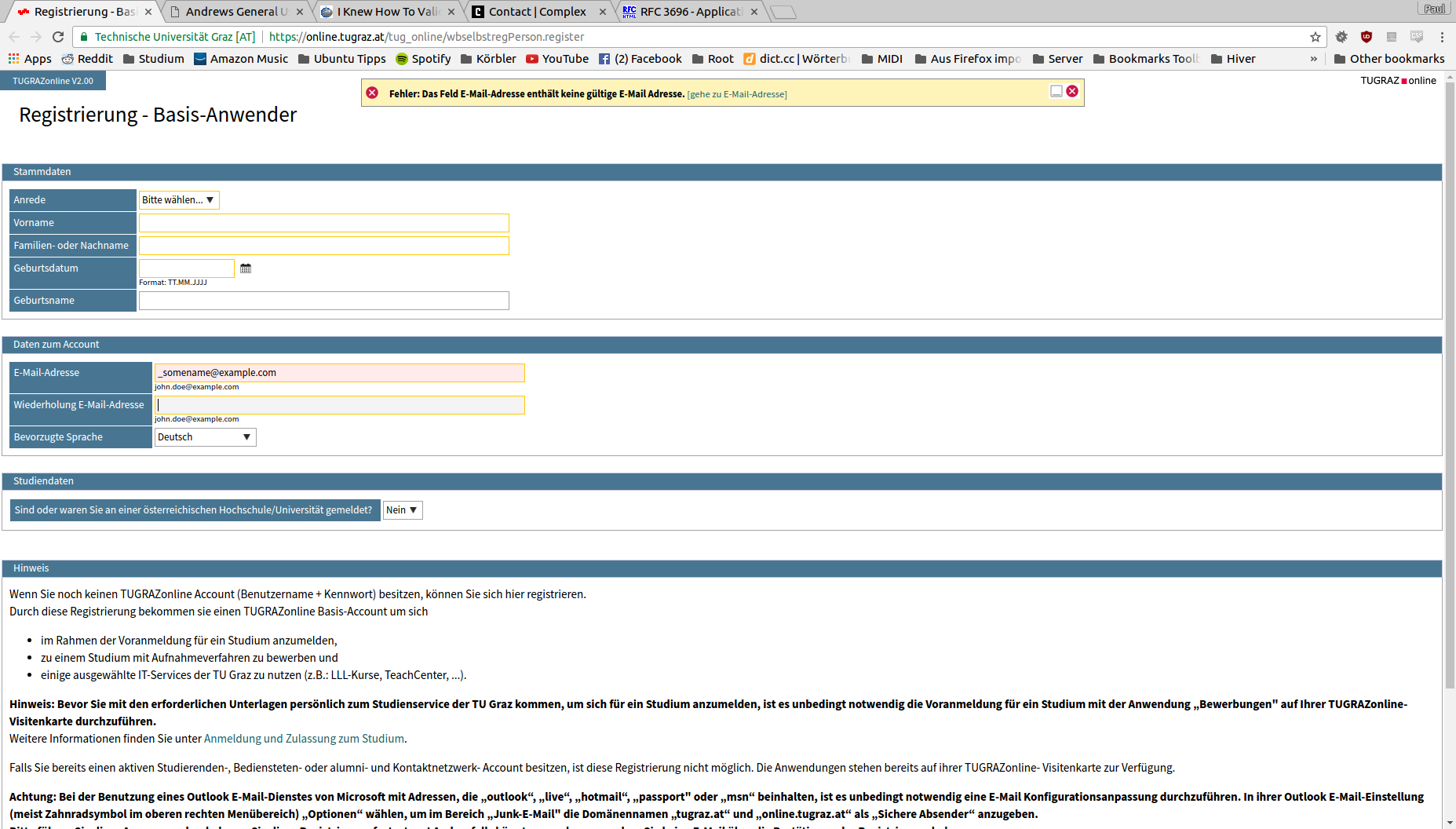
According to the RFC 3696 standard which is defining if a mail addresses is valid or not, the address "_somename@example.com" should be valid. However, it is marked as invalid in the form. - The search form is very small
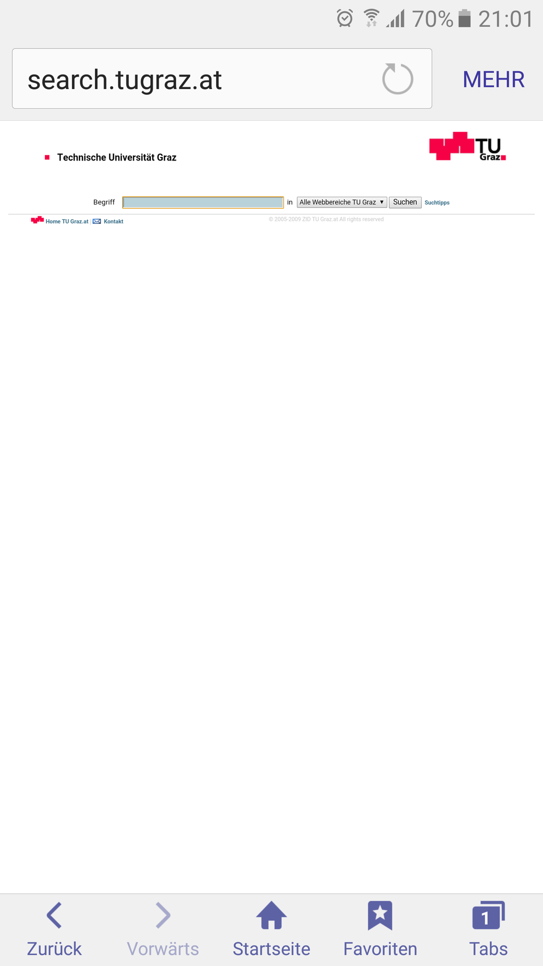
The search from is too small on mobile devices. The user is forced to zoom manually into the form. - No direct enrollment link
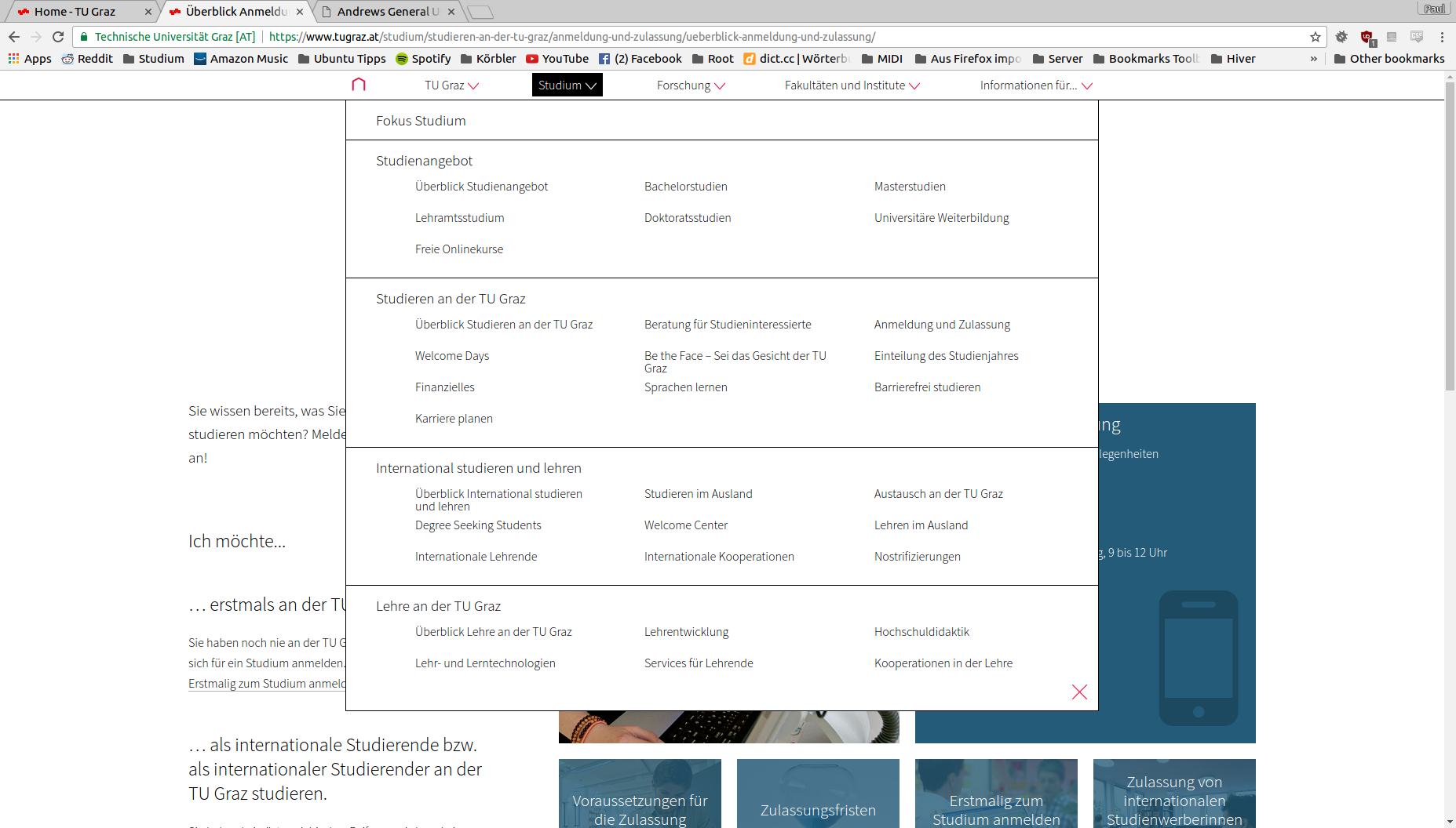
If you have decided to start a study at the TU Graz and want to enroll to a study you won't immediatey find something like a enrollment menu point. - Only hard to remember Username/Password possible
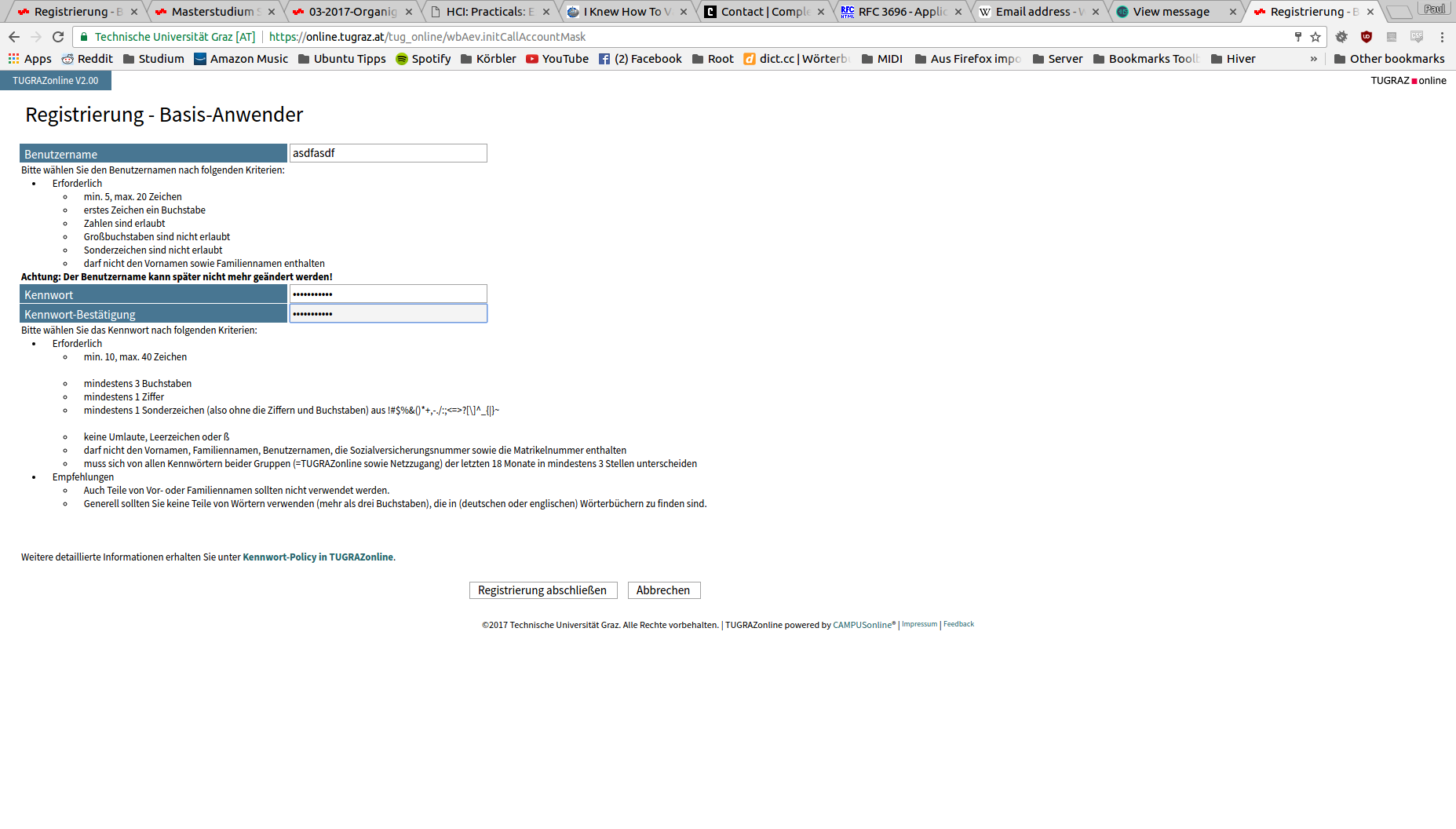
Usernames mustn't contain your own name which is ridiculous because it doesn't provide any means of security. Additionally, the password restrictions make it very hard to make a password rememberable. - Invalid E-mail
In the feedback form is an optional field for the e-mail address and there is no check if the e-mail is valid or not. - Search site has different design
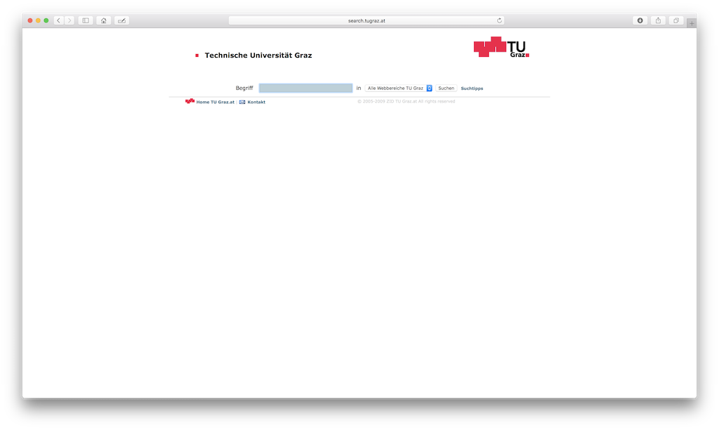
In the search page the menu bar, footer etc. is missing in comparison to the main page. If the URL wouldn't be a subdomain of tugraz.at you would think that you have been redirected to a scammer site. - Link failure
There are four links on this page which are not working. When one of them is clicked, the website offers no return and nothing happens.
2 Introduction
The web site we are going to evaluate provides information about the Technical University Graz. The visitor gets informed about the range of studies, facilities and institutes.
We are going to evaluate this web site, because we participate in the course Human Computer Interaction. We also want to get a good grade.
3 Evaluation Methodology
A heuristic evaluation is a fast, cheap and efficient way to check the usability of an user interface. To achieve this goal, a group of evaluators checks the UI individually and notes all the negatives and positives.
Heuristic Evaluation (originally proposed by Nielsen and Molich, 1990) is a discount method for quick, cheap, and easy evaluation of the user interface. [Danino2001]. At first the evaluators have to consider which target group is using the UI and describe their needs and tasks. The evaluators try to think and act like the typical user. This is necessary to find all the problems the users could face. (...) differences between heuristic evaluation sessions and traditional user testing are the willingness of the observer to answer questions from the evaluators during the session and the extent to which the evaluators can be provided with hints on using the interface. [Nie1995].
The evaluators also have to test on different platforms and devices the main target group may use. All the problems the evaluators find have to be documented for analyse purpose. During the documentation screenshots and screen captures are made for better visualisation and comprehensibility of the problem. For this evaluation, the "Andrews General Usability Heuristics", shown in Appendix A, will be used. These are based on and slightly adapted from Nielsen's revised set of ten usability heuristics [Nie1994]. These ten heuristics contain rules how a UI should look and response to an user. Then every evaluator puts his notes into a list and gives them grades depending on the importance of the problem. After the validation, the individual lists are merged into one big list and then get sorted by the importance of the problem. With this list of positives and negatives they can create the heuristic report. This detailed report will be given to the customer the heuristic evaluation was made for.
4 User Profiles
The typical user that generates the most traffic would be a prospective student. Since the lifeblood of a university are the people studying there, the university also wants to attract as many of them as possible. In addition to that, the site also wants to provide information about the quality of the university to employers of graduates. Another possible user group would be Jobseekers, who want to look up available job offers and most likely the pay. Students and graduates could also visit the site from time to time.
The prospective student is used to computers, knows his way around but also wants to see modern design. Since the user is used to responsive web and doesn't know the internet before it was as beautiful as it is now. The employer is most likely a business man using computers constantly since he looked up the university of his prospective employee. He doesn't want to spend a lot of time on the site and wants information as fast as possible. Jobseekers probably want to invest a lot of time in the site to gather as much information as possible about available job offers and the required qualifications for these. A student is already familiar with the site and uses it from time to time. He is very familiar with computers and uses them regularly. The graduate wants to connect with his fellow graduates. He doesn't use computers too much. Unless the interface is complex to handle, he/she is able to use it.
Our typical user, the prospective student, wants to get information about available studies and how to enroll into courses. The Curriculum of the study he is interested in is also very important for him. The employer wants to see the quality of the university in comparison to other national or international universities. The jobseekers want to look up available job offers and the amount of salary. Students want information about deadlines and the Curriculum. Graduates want to use the Alumni network to connect with fellow graduates.
5 Extent of the Evaluation
The field of the evaluation includes the whole website. The site consists of the main site and main menu which is separated in TU Graz, Studying and Teaching, Research, Faculties and Institutes and Information for. We assess every menu item in order to their usability. Each of the menu items provides specific information for the visitors of the website. As part of the evaluation we try to think like a typical and potential user and use the website like they would do. Every menu item is more or less important for specific users.
6 Evaluators and Evaluation Environments
The hardware and software used by each evaluator is shown in Table 1.
| Evaluator | Paul Ganster (PG) | Florian Leski (FL) | Franz Mandl (FM) | Maximilian Weber (MW) |
|---|---|---|---|---|
| Age | 21 | 21 | 21 | 21 |
| Sex | male | male | male | male |
| Device | XMG P505 | Apple MacBook pro | Samsung Galaxy S6 G920F 32GB | Samsung Galaxy S5 SM-G900F |
| Operating System | Ubuntu 16.04 | macOS Sierra Version 10.12.3 | Android 6.0.1 | Android 6.0.1 |
| Web Browser | Chrome Version 57.0.2987.110 | Safari Version 10.0.3 | Internet 4.0.10-53 (Samsung nativ Browser) | Chrome Version 56.0.2924.87 |
| Ad Blocker | uBlock Origin v1.11.4 | none | Adblock Plus for Samsung Browser | none |
| Internet Connection | 75 mbps, UPC Fiber Power Pack Medium | 30 mbps, A1 | 75 mbps, UPC Fiber Power Pack Medium | 30 mbps, A1 |
| Screen Size | 15″ | 15.4″ | 5.1″ | 5.1″ |
| Screen Resolution | 1920x1080 | 2880x1800 | 1440x2560 | 1080x1920 |
| Browser Resolution | 1920x735 | 2880x1800 | 1344x2560 | 1080x1920 |
| Date of Evaluation | 2017-04-14 | 2017-04-18 | 2017-04-13 | 2017-04-17 |
| Time of Evaluation | 12:01:00 | 15:00:00 | 21:00:00 | 19:20:00 |
MW used the native screenshot function by Samsung for his Android phone and for screen recordings the app AZ Screen Recorder was used. FM used the same tools for screenshots and screen recordings like MW. PG used RecordMyDesktop for Video Capture and the Ubuntu Native screenshot feature for screenshots. Quicktime player was used by FL for his MacBook.
7 Positive Findings
The top three to five positive findings according to their average positivity ratings are described in more detail below. The positivity rating scheme used to rank the positive findings is shown in Table 2.
| Positivity | Meaning |
|---|---|
| 4 | Extremely positive |
| 3 | Major positive |
| 2 | Minor positive |
| 1 | Cosmetic positive |
| 0 | Not a positive |
| Av | Average positivity |
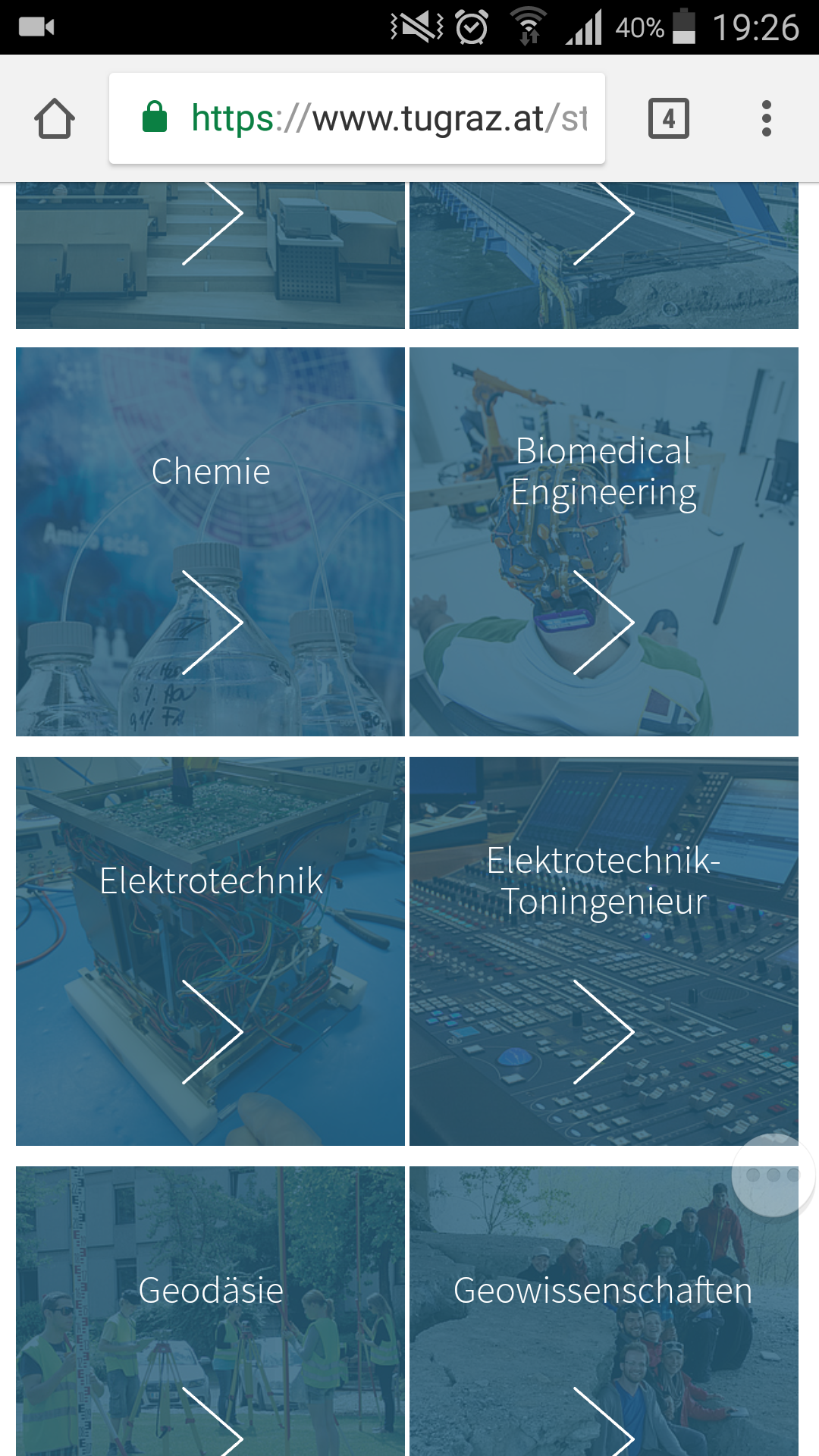
The main positives, which were found by the eveluators, refer to the design of the website. The first thing is the very important overview over all the studies.
7.1 Studies Overview
This site has a very good overview of all the Bachelor and Master studies which were offerd by the University. Upcoming students can easily find out more about the studies they are interested in. You can see the overview in Figure 1.
7.2 Easy Language Switch on Smartphone
It is very easy to switch the language from German to English when you visit the website on the smartphone. You just have to press the EN/DE button, which is on top of every site. You can see how it is done in Figure 2.
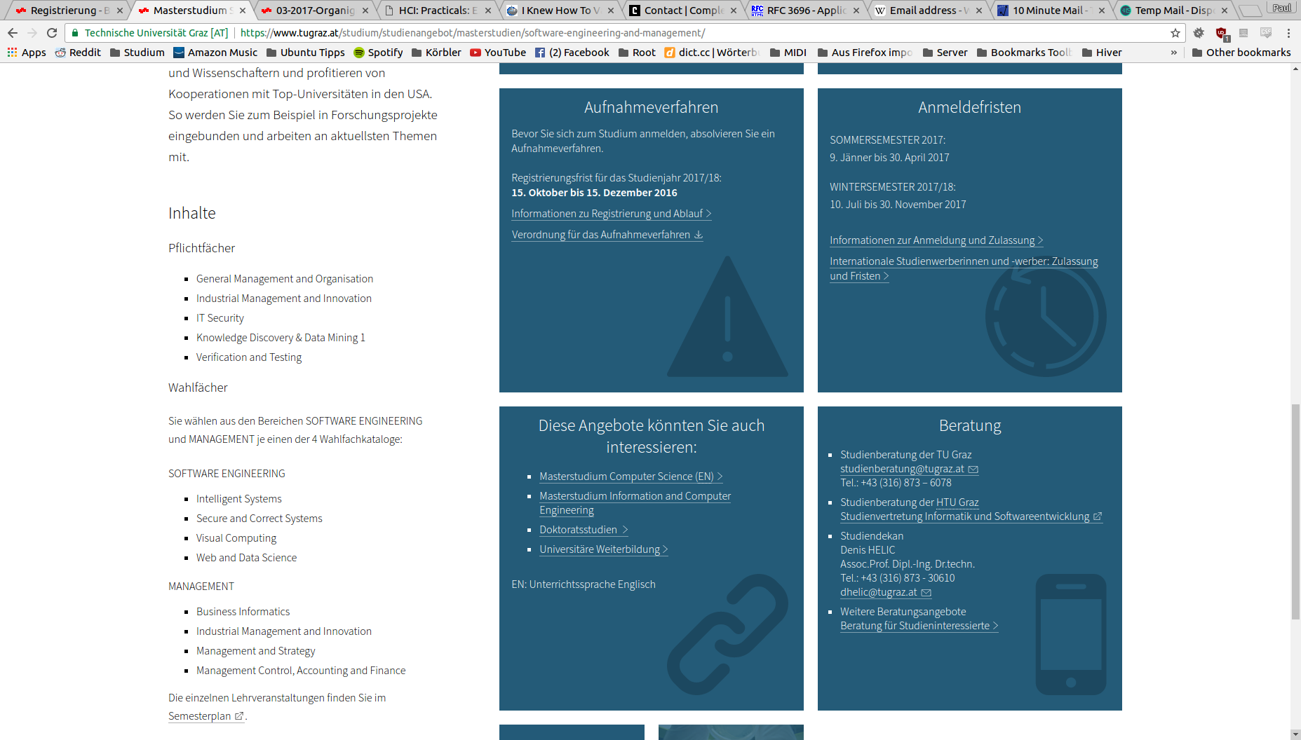
7.3 Clean Information Categorization
The tile design provides not only a clear information seperation (deadlines, links etc.) but also presents this information in an asthetic design. You can see it in Figure 3.
8 Analysis of the Main Problems
The top five problems according to their average severity ratings are described in more detail below. Problem number 1 is the problem (negative finding) with the highest average severity. The severity rating scheme used to rank the problems is shown in Table 3.
| Severity | Meaning |
|---|---|
| 4 | Catastrophic problem |
| 3 | Serious problem |
| 2 | Minor problem |
| 1 | Cosmetic problem |
| 0 | Not a problem |
| Av | Average severity |
8.1 Correct Mail Address is Invalid
A main problem founde by the evaluators is, that an RFC 3696 valid e-mail address is marked as invalid in the University registration form as shown in Figure 4.
8.2 Very small Search Form
On mobile devices, the search form the website provides, is too small. The user has to zoom in as shown in Figure 5.
8.3 No direct Enrollment Link
If you have decided to start a study at the TU Graz and want to enroll to a study, you won't immediately find something like an University enrollment menu point. The menu is shown in Figure 6.
8.4 Too complex Username and Password
The University username can't contain your own name which is ridiculous as it doesn't provide any means of security. Also the password restrictions make it very hard to make a password rememberable. The problem is shown in Figure 7.
8.5 Feedback Form E-Mail Check
There is an optional field in the feedback form for the e-mail address and there is no check if the e-mail is valid as shown in Figure 8.
8.6 Different designed Search Page
Also on the PC the Search page looks different. It is missing the menu bar, footer etc. the main page uses. If the URL wouldn't be a subdomain of tugraz.at you would think that you have been redirected to a different site. The page is shown in Figure 9.
8.7 Not working Links
There are four links on this page which are not working; when you click on them the website offers no return and nothing happens. This problem is shown in Figure 10.
9 List of Problems Found
Table 4 shows a list of all the problems found in the evaluation, sorted in descreasing order of average severity.| No. | Title | Description | Screenshot(s) / Video Clip | Heuristic | Browser / OS | Location (How Reproducible?) | Found By | Severity | |||||||
|---|---|---|---|---|---|---|---|---|---|---|---|---|---|---|---|
| FL | FM | MW | PG | FL | FM | MW | PG | Av | |||||||
| 1 | Valid mail address is invalid |
According to the RFC 3696 standard (https://tools.ietf.org/html/rfc3696) defining what mail addresses are valid, following address is valid "_somename@example.com". But it is marked as invalid in the form. |
n01-pg-validmailisinvalid.png | Error Prevention | In the top menu bar, click on TUGraz → Studium → Angebot und Zulassung → Erstmalig zum Studium anmelden → Voranmeldung then enter "_somename@example.com". | y | 4 | 4 | 4 | 4 | 4.00 | ||||
| 2 | Search form very small |
The search from is too small on mobile devices. The user is forced to zoom manually into the form. |
n02-fm-searchform.png, n02-mw-searchnotresponsive.png | Consistency | Start page → search icon | y | y | 3 | 4 | 4 | 3 | 3.50 | |||
| 3 | No direct enrollment link |
If you have decided to start a study at the TU Graz and want to inscribe to a study you won't immediatly find something like an University enrollment menu point. |
n03-pg-noinscription.png | Aesthetic and Minimalistic Design | In the top menu bar, click on TUGraz → Studium and you can't find something like that here. | y | 4 | 3 | 4 | 3 | 3.50 | ||||
| 4 | Only hard to remember Username/Password choosable |
Username can't contain your own name which is ridiculous as it doesn't provide any means of security. Also the password restrictions make it very hard to make a password rememberable. |
n04-pg-complexpassword.png | After validating your mail after completing the enrollment form (In the top menu bar, click on TUGraz → Studium → Angebot und Zulassung → Erstmalig zum Studium anmelden → Voranmeldung) you receive a mail with a link to this new form | y | 3 | 4 | 3 | 4 | 3.50 | |||||
| 5 | Invalid E-mail |
There is an optional field in the feedback form for the e-mail address and there is no check if the e-mail is valid |
n05-mw-feedbackmail.mp4, n05-fl-feedback.png | Error Prevention | Footer → feedback → e-mail field | y | y | 3 | 3 | 4 | 4 | 3.50 | |||
| 6 | Search site has different design |
The search page is missing the menu bar, footer etc. the main page uses. If the URL wouldn't be a subdomain of tugraz.at you would think that you have been redirected to a scammer site. |
n06-fl1-search.png, n06-fl2-search.png, n06-pg-incosistentdesign.png | Consistency | Click on magnifying glass in the top menu bar | y | y | 3 | 4 | 4 | 3 | 3.50 | |||
| 7 | Link failure |
There are four links on this page which are not working; when you click on them the website offers no return and nothing happens |
n07-fl-link.mp4 | Good Error Message | TU Graz → Working at TU Graz → Job Vacancies → Overview: Job Vacancies | y | 3 | 3 | 4 | 4 | 3.50 | ||||
| 8 | Close button of dropdown menu |
The close button of the dropdown menu is at the bottom of the dropdown menu. Of course you can close it by pressing on the text again but not anyone might know that and will search for this button. Also you land anywhere on the page after pressing and not at the top of the site. |
n08-fm-closebuttondropdown.mp4 | Recognition Rather Than Recall | Start page → Main Menu → Studying and Teaching → scroll down and press close button | y | 3 | 3 | 3 | 4 | 3.25 | ||||
| 9 | Slow Main Menu |
It took full 5 seconds from page load to actually show the main menu items the TUGraz logo is supposed to display. This is not due to slow internet connection but rather due to bad design. |
n09-pg-slowmenu.mp4 | Feedback | Visit the main page, simply call tugraz.at | y | 3 | 3 | 3 | 4 | 3.25 | ||||
| 10 | Long way to enrollment page |
If you already have decided for a study and just want to enroll to this study and fill out all online forms required for that you have to go a long way to actually reach this form |
n10-pg-longwaytoenrollment.mp4 | Aesthetic and Minimalistic Design | In the top menu bar, click on TUGraz → Studium → Angebot und Zulassung → Erstmalig zum Studium anmelden → Voranmeldung | y | 4 | 2 | 3 | 4 | 3.25 | ||||
| 11 | Reload of logo by changing language |
Red squares which form the logo of the TU Graz homepage were loaded twice when changing the language; then they disappear for a short time and they show againthey load once |
n11-fl-logo.mp4 | Aesthetic and Minimalist Design | click on the EN/DE tag | y | 3 | 4 | 3 | 3 | 3.25 | ||||
| 12 | Slow accessibility to Registration information |
Prospective students need to get information for the registration as fast as possible; however they have to click on several links to get there |
n12-fl-accesss.mp4 | Flexibility and Efficiency of Use | TU Graz homepage → Studying and Teaching → Registration and Admission | y | 3 | 3 | 3 | 4 | 3.25 | ||||
| 13 | Spelling error in Link |
There is a spelling error in the link, instead of “http” the developer wrote “hhttp”, so the link is not correct |
n13-fl-spelling.png | Good Error Message | TU Graz homepage → Organisational Structure → Service Departments and Staff Units → International Relations and Mobility Programmes | y | 3 | 3 | 3 | 4 | 3.25 | ||||
| 14 | search result not responsive |
If you click on a link after the search, the relut is also not responsive. |
n14-mw-aftersearchnotresponsive.png | Aesthetic and Minimalist Design | search button → result | y | 3 | 3 | 3 | 3 | 3.00 | ||||
| 15 | Career page is solely in German |
There is no option to change the language of the career page; it’s only available in German |
n15-fl-career.png | Consistency | TU Graz → Career page | y | 2 | 3 | 3 | 4 | 3.00 | ||||
| 16 | Wrong linking |
Clicking on the TU logo brings me to the German website. |
n16-fm-wronglinking.mp4 | Consistency | Start page → click on the TU Graz logo | y | 3 | 2 | 3 | 3 | 2.75 | ||||
| 17 | Contradicting content |
On the same page contradicting content is shown. On the left side the side claims that especially gender won't play a role for being picked for the job, but on the right side the side claims that you will be more likely picked if you are a woman. |
n17-pg-contradictingcontent.png | In the top menu bar, click on TUGraz → Offene Stellen and under the tile "Neues Jobportal der TU Graz" click the link "Ausgeschriebene nicht- wissenschaftliche Stellen" | y | 3 | 3 | 3 | 2 | 2.75 | |||||
| 18 | too long menue |
The menue is way too long for using it on the Smartphone. |
n18-mw-longmenue.mp4 | Aesthetic and Minimalist Design | Hauptmenü | y | 2 | 3 | 2 | 4 | 2.75 | ||||
| 19 | registration field not responsive |
After being redirected to the enrollment page you encounter a page that has a completely different design than the other pages you have visited. If it wasn't a subdomain of tugraz.at you wouldn't want to enter personal information in fear of scammer. |
n19-mw-registrationnotresponsive.png, n19-pg-inconsistentenrollmentdesign.png | Consistency | Hauptmenü → Studium → Studieren an der TU Graz → Anmeldung und Zulassung → Account erstellen | y | y | 2 | 3 | 3 | 3 | 2.75 | |||
| 20 | Language change by switching to homepage |
When the logo on the top right is clicked; the browser opens the homepage but always in German |
n20-fl-language.mp4 | Flexibility and Efficiency of Use | Switch to English Version → click on any link → go back to the homepage | y | 3 | 2 | 3 | 3 | 2.75 | ||||
| 21 | Unhandy calendar navigation |
The buttons for the next and previous month are very small. Every time you click on this button you land on the top of the site and you have to scroll down to the calendar again. When the user gets to the top it is not obvious for the user if he clicked on the right button. He might think he got back where he came from. |
n21-fm-calendarnavigation.mp4 | Recognition Rather Than Recall | Start page → Main Menu → TU Graz → Services → TU Graz events | y | 2 | 3 | 2 | 3 | 2.50 | ||||
| 22 | Slow menu close |
When accidently clicking a menu entry and by clicking on the menu entry again to close it the closing process takes 2 seconds. |
n22-pg-slowmenuclose.mp4 | Feedback | Click on a menu botton of the top menu bar and click on it again after it has opened | y | 3 | 2 | 2 | 3 | 2.50 | ||||
| 23 | responsive bug |
After searching in the searchbar and going back to the website the menue was not responsive anymore. |
n23-mw-responsivebug.mp4 | Aesthetic and Minimalist Design | first search, then → Hauptmenü | y | 2 | 3 | 2 | 3 | 2.50 | ||||
| 24 | not every site is responsive |
Some sites are not responsive on the smartphone. |
n24-mw-notresponsive.mp4 | Aesthetic and Minimalist Design | Hauptmenü → Unternehmensbeteiligungen | y | 3 | 3 | 3 | 1 | 2.50 | ||||
| 25 | html mistake |
In the news section, there is a mistake in the html file. (<abbr ...) |
n25-mw-htmlmistake.png | Hauptmenü → TU Graz → Services → News+Stories → Übersicht | y | 2 | 1 | 3 | 4 | 2.50 | |||||
| 26 | Feedback form |
The feedback form doesn't look natural. A normal user would expect a white rectangle where he puts his text and not a line. |
n26-fm-feedbackform.png | Recognition Rather Than Recall | Start page → Feedback | y | 3 | 1 | 2 | 3 | 2.25 | ||||
| 27 | Wrong language |
After clicking on "Suchtipps" one would expect a german page with either the design of the actual main TUGraz page or at least the same design as the search page. But it is another different deisgn and it is only provided in English (As indicated in the first paragraph of this page). Also the favicon is missing. |
n27-pg-englishpage.png | Consistency | Click on magnifying glass in the top menu bar, click on "Suchtipps" on the next page. | y | 3 | 2 | 2 | 2 | 2.25 | ||||
| 28 | too many links |
There are too many ways to come from one point of the website to another. (confusing) |
n28-mw-toomanylinks.mp4 | Aesthetic and Minimalist Design | Hauptmenü → Leitbild | y | 2 | 3 | 3 | 1 | 2.25 | ||||
| 29 | Background highlight of tabs |
The main menu item which is opened at the moment is always highlight; also when you want to switch to another menu item; this is confusing for visitors and they don’t know which item is open right now |
n29-fl-highlight.mp4 | Aesthetic and Minimalist Design | Click on the main menu and choose new tab | y | 2 | 1 | 3 | 3 | 2.25 | ||||
| 30 | Video does not work |
The TU Graz Image video does not work and the screen stays black. Disabling ad blocker does not solve the problem and there is no error message why it doesn't work. |
n30-fm-videotugrazimage.png | Good Error Messages | Internet / Android 6.0.1 | Start page → Main Menu → TU Graz → TU Graz at a Glance → press play | y | 2 | 2 | 3 | 1 | 2.00 | |||
| 31 | Unclear content |
When wanting to search for job offers for non science jobs you are at first greeted by a philosophy and a link to ACTUAL science jobs and if you want to find the actual non-science job offers you have to scroll to the bottom. |
n31-pg-unclearcontent.mp4 | Aesthetic and Minimalist Design | In the top menu bar, click on TUGraz → Offene Stellen and under the tile "Neues Jobportal der TU Graz" click the link "Ausgeschriebene nicht- wissenschaftliche Stellen" | y | 2 | 1 | 2 | 3 | 2.00 | ||||
| 32 | Every institute has own design |
The appearance of each institute is different; this is very inconsistent and it’s hard to get the same information from the different pages |
n32-fl1-institute.png, n32-fl2-institute.png | Consistency | TU Graz homepage → Faculties and Institutes → choose any institute and open link | y | 2 | 1 | 2 | 3 | 2.00 | ||||
| 33 | Different actions |
When clicking on another image, the picture opens in a new tab instead of the site's picture viewer as mentioned before. |
n33-fm-differentactions.mp4 | Consistency | Start page → Main Menu → TU Graz → Services → Media Service → Protective switch to treat obesity → click on the picture | y | 2 | 2 | 1 | 2 | 1.75 | ||||
| 34 | Two sections called TU Graz |
It can be very confusing when two sections (a main section and a sub section) have the same name. |
n34-fm-twosectionscalledtugraz.png | Consistency | Start page → Main Menu → TU Graz → Diversity | y | 2 | 2 | 1 | 2 | 1.75 | ||||
| 35 | Main Menu disappears |
When the visitor opens the page of a faculty the page is opened in a new tab; there is also a different design and the main menu link is not shown; instead there is the logo of the TU Graz which is a link to the homepage |
n35-fl-faculties.png | Consistency | TU Graz homepage → Faculties and Institutes → choose any faculty and open link | y | 1 | 1 | 2 | 3 | 1.75 | ||||
| 36 | Underline of abbreviations |
The <abbr> tag is formatted similar to a <link> tag; this behaviour leads to misunderstanding and the visitor is not sure if this is a link or not |
n36-fl-abbreviation.png | Consistency | TU Graz → Research → Research and Technology Advisory Committee | y | 2 | 1 | 2 | 2 | 1.75 | ||||
| 37 | Information about organisation structure not in tiles |
We are used by the side that information is in tiles but instead only the links are in tiles and information about each subcategory is compressed on the left side whilst leaving the right part empty. |
n37-pg-informationnotintiles.png | Consistency | In the top menu click TU Graz → Organisationsstruktur | y | 2 | 1 | 1 | 2 | 1.50 | ||||
| 38 | Text is out of the view |
When you scroll down on the Focus on TU Graz page the first sentences of the first paragraph is out of the view |
n38-fl-scroll.mp4 | Aesthetic and Minimalist Design | scroll down on Focus TU Graz | y | 1 | 2 | 1 | 2 | 1.50 | ||||
| 39 | Picture got smaller |
When you click on an image you would expect that the image gets bigger. But in this case the image gets smaller. |
n39-fm-smallerpicture.mp4 | Consistency | Start page → Main Menu → TU Graz → Services → Media Service → click on the picture nearby Contact | y | 1 | 2 | 1 | 1 | 1.25 | ||||
| 40 | German Text |
German text "Aktuelle News" was found. |
n40-fm-germantextaktuellenews.png | Consistency | Start page → Main Menu → TU Graz → Services → News+Stories → click on the image → scroll to the bottom | y | 1 | 1 | 1 | 1 | 1.00 | ||||
| 41 | Invisible arrow |
When hovering over a main menu entry the arrow turns black and depending on the menu content turns invisible. |
n41-pg-invinsiblearrow.png | Hover over a menu item with a dark content. | y | 1 | 1 | 1 | 1 | 1.00 | |||||
| 42 | Tile Content continuing in different tile |
The whole tile design of has the purpose to categorize each information part into a small chuncks that are not related to each other. (E.g. contact info vs study course info). But for external evaluations this tile design is simply used to continue the information paragraph which is kind of confusinhg. |
n42-pg-unclearcontent.png | Consistency | In the top menu bar, click on TUGraz → Qualitätsmanagement and then scroll to the bottom. | y | 1 | 1 | 1 | 1 | 1.00 | ||||
| 43 | Cut-off menu entry that is not cut-off |
The ellipsis after the last top menu entry "Information für ..." creates the impression that the menu entry is cut-off but it isn't actually. Badly chosen menu entry name. |
n43-pg-unusualmenuname.png | In the open top menu the last menu entry at the right side. | y | 1 | 1 | 1 | 1 | 1.00 | |||||
| 44 | Text overlay |
The text on the left side next to the images is overlaying the text below when the visitor scrolls fast to the bottom of the page |
n44-fl-overlay.mp4 | Aesthetic and Minimalist Design | TU Graz homepage → TU Graz at a Glance | y | 1 | 1 | 1 | 1 | 1.00 | ||||
| 45 | too much text |
On some sites is too much text. On the smartphone you have to scroll down for a very long time. |
n45-mw-toomuchtext.mp4 | Aesthetic and Minimalist Design | Hauptmenü → Unternehmensbeteiligungen | y | 1 | 1 | 1 | 0 | 0.75 | ||||
| 46 | Main menu always hides |
By clicking on another main tag the main menu disappears; this is annoying for visitor who want to switch between tags fast or search for a specific page |
n46-fl-menu.mp4 | Flexibility and Efficiency of Use | Click on another link on the page except the homepage | y | 1 | 0 | 2 | 0 | 0.75 | ||||
| 47 | Same icon twice |
The same icon is used twice for the same function. |
n47-fm-sameicon.png | Aesthetic and Minimalist Design | Start page → Talking about ... → Face to face - People at TU Graz → It's the same for everyone at the beginning → scroll to the bottom | y | 0 | 1 | 1 | 0 | 0.50 | ||||
| 48 | Useless tip |
The tip according accessibility is useless on mobile devices because you don't have Ctrl, + or -. |
n48-fm-uselesstip.png | Help and Documentation | Start page → scroll to the bottom | y | 0 | 1 | 0 | 0 | 0.25 | ||||
| Code | Meaning |
|---|---|
| FL | Florian Leski |
| FM | Franz Mandl |
| MW | Maximilian Weber |
| PG | Paul Ganster |
| y | Found by this evaluator |
References
- [Nie1994]
- Jakob Nielsen;
Enhancing the Exploratory Power of Usability Heuristics;
Proc. Conference on Human Factors in Computing Systems (CHI’94).
ACM. Boston, Massachusetts, USA, Apr 1994, pages 152–158.
doi:10.1145/191666.191729 - [Nie1995]
- Jakob Nielsen;
How to Conduct a Heuristic Evaluation;
Visited 2017-03-23.
https://www.nngroup.com/articles/how-to-conduct-a-heuristic-evaluation/ - [Danino2001]
- Nicky Danino;
Heuristic Evaluation - a Step By Step Guide Article;
Visited 2017-03-27.
https://www.sitepoint.com/heuristic-evaluation-guide/
A Heuristics Used by the Evaluators
The evaluators used the Andrews General Usability Heuristics 2013
found in file:
heuristics.pdf.
B Individual Evaluation Logs
The individual evaluation logs are listed below.
| Name | Log File |
|---|---|
| Florian Leski | log-fl.txt |
| Franz Mandl | log-fm.txt |
| Maximilian Weber | log-mw.txt |
| Paul Ganster | log-pg.txt |
C Spreadsheet
The filled-out spreadsheet of all problems and positives including
their ratings is helist.xls.
